ProTypestyles

Showing posts with label Title Sequence. Show all posts

Sunday, January 4, 2015

Inspiration: The Best Title Sequences of 2014 from Art of the Title

Art of the Title not only creates their list of the Best Title sequences of 2014, but they furnish some background and give production credit where credit is due.

Check out Art of the Title's list and article here.

Monday, September 22, 2014

Inspiration: The Six Million Dollar Man from Art of the Title

Some title sequences have to shoulder more story-telling load than others.  Sometimes the premise is uncommon enough that very few viewers will understand it without help.

One of my favorite shows as an 8 year old boy was the Six Million Dollar Man, and the situation was pretty well-defined by the time the opening credits were over.

An astronaut flying an experimental plane crashes, nearly dies, and turns into a combination of Borg and secret agent through the creative use of after-market parts.

The Art of the Title has the details on how it all came together...40 years ago.

Saturday, July 19, 2014

Sunday, May 4, 2014

Inspiration: AMC's Mad Men from Art of the Title


Another example of how the Imaginary Forces team puts together an iconic title sequence.

Art of the Title has a full write-up on the creation of the title sequence for AMC's Mad Men.

Read the full article.

Saturday, February 8, 2014

Inspiration: How they made the 'Archer Vice' Title Card

For the 5th season of FX Network's Archer, the show has taken a new direction that may seem familiar to those of us who lived through the heady days when television audiences could accept that a Miami cop would possess an Italian supercar as his "daily driver."

For the new 'Archer Vice' Title on the FX Network, the show's producers wanted to really make sure that they sufficiently communicated the series' new direction in the title card.

Read the article to get the complete rundown of how they constructed the effect in this perfect illustration of how titles are more than just text.

Saturday, February 1, 2014

Inspiration: Art of the Title looks at Black Sails

Art of the Title takes a look at one of those title sequences that just seems to hit the right note in visual tone and sound...pacing and visual content...

Take a look at the title sequence from Black Sails and read Art of the Title's excellent article covering the concept and the creative process behind it.

See the article here.

Wednesday, January 15, 2014

Inspiration: Agatha Christie's Poirot Title Sequence

Agatha Christie's Poirot from London Weekend Television (now ITV), and aired in the United States on A&E and PBS as simply "Poirot" had a title sequence that really set the tone for the program.

The imagery brought the Art Deco feel of the 20s and 30s to the task of establishing the character in his era.

Saturday, January 11, 2014

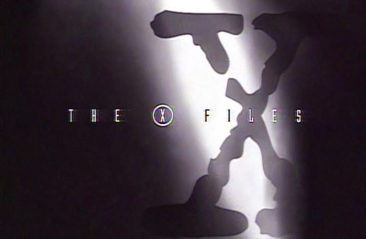
Inspiration: The X Files Title Sequence from Art of the Title

The X-Files was a bit of a phenomenon in the television environment of the early 90's.  In some ways the title sequence didn't call  special attention to itself as it just seemed like an extension of the program proper...an innovative component to an innovative project.
With a concept and effects work that represents legitimate accomplishment in the context of the early 90s, The X-Files title sequence can be reviewed at Art of the Title.

Thursday, January 9, 2014

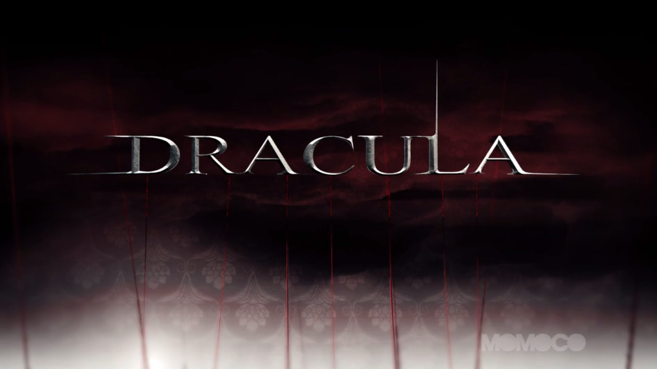
Inspiration: NBC's Dracula Title Sequence

There is a lot going on in this title sequence.  The text is actually the minority of the content in this visually complex series open for NBC's Dracula.

A very condensed, elaborate title sequence...for a broadcast project.


...from the Title Design Project.

Saturday, January 4, 2014

Inspiration: CARNIVALE Opening Credits

Yes, I know that HBO's Carnivale may be old news in television programming terms, but the opening credits remain one of my favorite examples of how a well-crafted and conceived opening credit/title sequence can set the aesthetic for the program.  Well worth another look...

Sunday, December 29, 2013

Inspiration from Art of the Title: National Lampoon's Christmas Vacation

The Art of the Title has the perfect article for our last weekend during the holidays.  The animated title sequence for National Lampoon's Christmas Vacation declares war on Santa Claus, and perhaps worse...reveals an embarrassing problem with his pants when he bends over.

Take a look at the sequence and read the article and note the countless dangers that Mr. Kringle is subjected to...including frostbite.

Wednesday, December 25, 2013

1964's Rudolph Titles from Watch the Titles

In a timely feature, Watch the Titles breaks down the title sequence from the 1964 Rankin & Bass stop-motion classic "Rudolph".
They even pick out the erroneous copyright date (apparently it wasn't created in 1164...I suppose it would have had more of a tell-tale "crusades" sort of theme if it had been).

Thanks to Watch the Titles.

Sunday, December 22, 2013

Inspiration: Title Design Project

Another great site for the film and television title design enthusiast (...see how I totally avoided using the words 'geek' or 'nerd' there?) is the Title Design Project.

They earn a spot in our links list and in addition to galleries, clips, interviews and articles, they have a blog.

Saturday, December 21, 2013

Inspiration: Saul Bass at the Design Museum

Saul Bass  (1920-1996)
If film typography is of interest to you at all... then you know Saul Bass.  The commercial artist who designed the visual identities of AT&T, United Airlines and Minolta designed a movie poster for Otto Preminger that resulted in the director asking him to design the actual title sequence and the age of the opening credits of the movie being more than bland, dry information that audiences simply endured were over.

Check out the entire write up at the Design Museum.

Wednesday, December 18, 2013

Inspiration: Watch The Titles

A new site joins the permanent link list... watchthetitles.com 

The site has clips and interviews surrounding titling for film, television, and events and is well worth a place in your search route in those moments when you're seeking type-based inspiration.

Sunday, December 15, 2013

Inspiration: The Art of Film & TV Title Design | Off Book | PBS Digital Studios


PBS Digital Studios interviews Karin Fong and Peter Frankfurt of Imaginary Forces, Zombieland creative lead Ben Conrad, and Blue Valentine Editor Jim Helton about the process of creating effective feature and television titles.

Saturday, December 14, 2013

Inspiration: James Bond; 50 Years of Main Title Design at Art of the Title

Saturday is a good day for some low-pressure inspiration while you sip your weekend coffee, and from the extensive Art of the Title archives, their extensive retrospective on 007's title sequences.

As hard as it may be to believe, Dr. No was made in 1962 and James Bond became a rather significant British export for what has become a rather significant period of time. 

Check out how the title sequences were conceived and created in Ben Radatz's  fascinating article.

Sunday, December 8, 2013

Inspiration: Semi Permanent

Danny Yount shows us how creativity trumps budget with his titles for the Portland stop of the 2013 Semi-Permanent creative festival. 

Of course, we probably should mention that Mr. Yount has some experience with projects that are not so low budget, like directing the main titles for Iron Man, Sherlock Holmes, and Six Feet Under.

Check out what an exceptional creative mind can do with some rather ordinary gear at Art of the Title.


Saturday, November 30, 2013

Inspiration: Text from the TARDIS

One of my favorite sites is the Art of the Title.  (Check out the permanent link to the right.)

If one of your obsessions in life is the BBC's Doctor Who, then you'll want to head over to the Art of the Title and take a look at their retrospective of the long-running show's Opening Titles.