ProTypestyles

Showing posts with label Quick Tip. Show all posts

Wednesday, June 25, 2014

S4T Tip: Saving Custom Premiere Pro Title Templates (It's only weird the first time...)

 If you are a person having a difficult time figuring out how to save your own custom title template in Premiere Pro's Title Designer, you aren't alone.

To call the process 'unintuitive' is probably charitable, but once you understand the language and the odd interface design, it's actually extremely simple...there are, quite literally, 3 steps.
Figure 1 (click to enlarge)


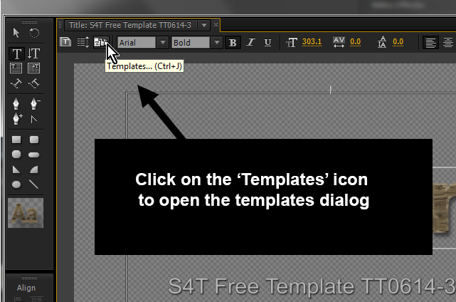
Step 1 is illustrated on figure 1...find the 'Templates' icon and click on it.


Step 2 is laid out in figure 2.  You need to go to the top/right of the templates dialog and click on the unlabeled button, which opens the panel menu.


Figure 2 (click to enlarge)
Step 3 is to forget everything you know about the terminology used in every other part of Premiere Pro, because you won't see a 'save' option of any kind in that menu.  To store the title you're currently working on as a template that you can recall later, choose 'Import Current Title as Template'.  Yes, I know that importing something already in the project seems odd...even 'Export Current Title as Template' would make more sense if 'Save Template' is somehow unworkable..but there you have it.

For information on how to save S4T Free Templates to your library or where the templates are located on your system, download our docs on the topic here.

Tuesday, June 17, 2014

Free S4T Premiere Pro Title Template plus Texture: Old Plank

click to enlarge
 At Style4Type, we've been showing off a lot of features inside the Premiere Pro Title Designer that many users just don't discover on their own.

One of the least knwon features of the Premiere Pro Title Tool is the 'Texture' mapping capabilities for text Fill and Stroke properties.

S4T Texture_Old_Plank 1.jpg  (click to enlarge)
For this week, we've created a Title with a texture mapped into the Fill and Stroke faces.  The texture (S4T Texture_Old_Plank_1.jpg) is included with the .prtl file in a zip file, as you'll need the texture to use this title (most likely with some text of your own of course) in your own productions.

Texture parameters for Fill (click to enlarge)


We've included a screen grab of the Texture parameters under the Fill Properties in the Title Designer interface.  You'll probably notice that the parameters available to customize how textures are mapped on text are extensive.   By playing around with them, you can create new looks which all use a common texture file.  If you have a file of your own you'd like to use as a texture map, just click on the box to the right of "Texture" in the interface to open the load dialog.

We'll do more with Textures in the near future, but you can start to work with Texture mapping your own titles today by downloading the free S4T Premiere Pro Title Template here.

Wednesday, May 28, 2014

S4T 45 Free Typestyles: You choose the font, and we supply the rest

Style4Type 45 Free Typestyles (click to enlarge)
Some of you might look at our 45 Free typestyles and be concerned that you don't see a lot of type face variety.

Next to the original typestyle library that shipped with your software, the actual fonts that are visually represented are few in our 45 Free S4T Typestyles Library set.

The default typestyle library (click to enlarge)
Since versions of Premiere Pro since CS3 are available for Windows and Mac and those two systems have different fonts included with the system, and on top of that, each user can add fonts to their system over time, there isn't a good way to predict which compatible fonts are installed on each user's system.

For this reason, most S4T Typestyles (there are a few exceptions) are built around basic fonts like Arial or Times.  This makes the results for our users as predictable as possible.

4 different fonts using the Superbroadcaster 'style'  (click to enlarge)
Keep in mind that this presents no limitation for you, as the user.  You can simply type some text using an S4T Typestyle and then change the font to something you'd prefer from your system and keep the 'style' attributes.

You could also take an existing type object and simply apply a style without changing the font (use Alt/Opt).  The four type objects shown to the left all use the "Superbroadcaster' typestyle from the Free S4T Typestyle Library.

The Title Designer tool inside Premiere Pro continues to be an undiscovered gem for most users...at least most users who haven't yet discovered Style4Type.com.

Download 45 Free Style4Type Typestyles here...and check out the Premium Styles and Templates available for Premiere Pro while you're there.

Friday, December 6, 2013

S4T Tip: Establish Lower 3rd Style Using the Longest Name/Title

We've all been there.  The corporate video needs some serious type chops and we design a beautiful lower 3rd for use on all our interviews.  We used the company president's name in the corporate font...it's perfect.

Then...it happens.  Maybe it's a modern woman (or man) who has decided to hyphenate rather than just use the husband's family name...  Sometimes it's the over-achiever who has 10 job titles, each necessary to their identity.  Somehow, you'll end up with pain unless you develop your lower 3rd template using the longest name, and/or identifier-title to determine your layout.

It seems like a silly, minor thing until you have that documentary with 42 interviewees and the one that blows up the lower 3rd design is number 38...

Cheers.

Sunday, December 1, 2013

S4T Tip: Nothing like a 4K Title

Every so often you run into an occasion where you want a title to enter (or leave) frame by moving on the Z axis.  The best way to create this illusion in a 2D environment is to scale the title graphic up.  Of course, any time you scale any pixel-based graphic up, you'll see softness best-case...worst case it will start to look like the cubic environment of Minecraft.  Either way, it won't be good.

In Adobe Premiere Pro, your title document size is determined by the sequence that has the focus when you start to create a new title.

For this reason, I often have 4K sequences in projects where I'm editing HD 1080 or even 720p footage for HD output.  When I make a title I know I'll be zooming in on, I click into the 4K sequence before creating the new title.  The 4K title can easily be scaled down, but it also scales up and maintains its sharp edges.

*Fair warning: on a system with limited RAM or installed GPU, working with lots of 4K titles can start to bog things down, but when you need one to scale up, it's worth the hassle.